
Ray Dalio emphasizes credit cycles as integral to his firm’s investment strategy. Watch this video on how the economy functions:
While we can be sure the pattern will repeat itself in some form or another, we can only be sure how the pattern played out in the past and play the game of averages. With the benefit of hindsight, we can analyze how the past few crises have shown up in the numbers.
Debt Cycle Visualized
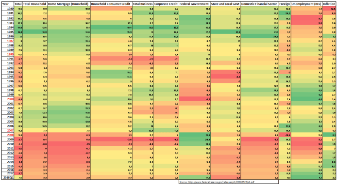
The above data, sourced from the Federal Reserve, are growth rates for the public US debt market broken down by sector. When the heat map is green, that denotes fast growth in credit. Unemployment and inflation are in the last two columns. When unemployment/inflation are low, green is shown; when unemployment/inflation are high, red is shown. High unemployment and inflation are intuitively bad for financial markets. Stability is paramount for economies to grow.
Interpretation
By visualizing the different portions of the credit market on a heat map, we can see how each crisis evolved.
In 2008, the Great Deleveraging, as Dalio calls it, revolved around too much credit growth in the Home Mortgage segment. In 2002-06, there was massive growth in these markets, shown in green in the heat map above. In the aftermath of the Great Deleveraging, we can see how the Home Mortgage segment growth was demolished, leading to collapsing home prices and economic disaster. This crisis spilled over to the Household Consumer credit market (credit cards, personal loans, etc.), the Domestic Financial Sector credit market (banks deposits, interbank loans), and into unemployment.
In 1984-86, we see massive growth in the overall credit market; this led to the crashes in 1987 and 1990. The market couldn’t sustain the amount of debt Americans were taking on. We have seen an uptick in growth in the most recent quarter. However, the growth is most concentrated in US Federal government debt. If fiscal stimulus spills over, and we actually see trickle-down economics work, we will get a rise in inflation which is historically a boon to equity markets.
Predictions
A data analyst’s job is to make a story out of numbers. Using hard, factual information data analysts must try to predict the future. It’s like trying to drive using only the rear facing mirror. As such, it’s difficult to make predictions based on past data.
That being said, most of the mainstream media attention has been drawn to inflation and to the US Federal Government budget deficit. Unemployment is the lowest we’ve seen in decades, yet the Trump Administration is throwing oil on an already raging market. This goes against classical Keynesian economics, which states fiscal policy should be aimed at keeping markets stable (fiscally conservative near the highs, fiscal stimulation during the lows). The current US equity market situation is anything but sustainable. We’ve seen massive growth in big tech equities, fueled by stock buybacks and cheap credit (see: Get Paid to Take Risk).
A lot of focus is put on inflation and unsustainability of credit market growth, but the Total Credit Market growth column of the heat map tells a different story. We have had an uptick in the total debt market growth, but it is nowhere near the same levels as before the 1987 & 1990 crashes or the 2008-09 crash.
Risks
The danger lies in rising interest rates. As US interest rates rise, debt becomes harder to pay back. This means more defaults and bankruptcies. It’s a cycle that feeds on itself and can turn into a death spiral without proper regulation. There has been a recent push for less regulation from the Trump Administration, which is a cause for concern. Emerging market dollar-denominated debt is also a cause for global growth concern.
I highly recommend reading Howard Marks’s most recent memo on debt markets, The Seven Worst Words in the World. Spoiler alert: those words are “too much money chasing too few deals.” The heat map above definitely doesn’t tell the whole story.
Bottom line:
Upon reading Marks’s memo, I am cautious as private debt seems to have grown beyond sustainable levels. United States and European equities are at or near all-time highs. However, unemployment is low, inflation is sustainable, and public debt market growth looks mild. Banking sector debt looks stable and manageable. I see no reason to predict a deleveraging in the coming years given the above heat map.
I am cautiously optimistic about the next few years.
Thanks for reading,
/tommander-in-chief
Further Reading:
- The Seven Worst Words in the World – Oaktree Capital Management
- Why is a High Rate of Inflation Bad for the Economy – Sciencing
Disclaimer: A journalist’s job is to make the stories that data analysts tell us emotional. Reporting is a sales profession. Be wary of what you read, because everyone in the news is selling something. This article is not to be taken as investing advice. Consult your financial advisor before acting on any of the opinions set forth.
 fungible thoughts
Leave a comment